Within this specific issue that I chose to review, there are a number of different aspects included that mean the target audience of people aged between 15-24 are allured to purchase the magazine.
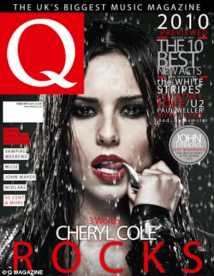
The masthead of Q magazine always stays the same, being presented as a red square with a white "Q" positioned central to it. As addition to this, the positioning and size of the masthead will always be the same in each issue, meaning that it will always be placed top left. In some issues, the masthead is covered up by the main image, leaving only half of the Q showing. As this brand of magazine is instantly recognisable in society, the publishers feel that it is acceptable to do this, meaning that other more important features can be larger. In this case, the main image of "Cheryl Cole" has been positioned behind the masthead, meaning that the brand is the main focal point. I feel that in this situation, Cheryl Cole has been placed behind the masthead to show the audience the connection between such a pop/mainstream singer and the rock magazine.
In the main image, Cheryl Cole has been made to look seductive towards its audience. I feel that this is more of a persuasion for males to approach this magazine and purchase it. Being photographed in such a way that shows her standing in the rain with heavy make -up on shows lack of realism and how unlikely it would be to look so perfect in such bad weather. From this knowledge, I feel that the audience have time to shed light on how perfect she is and due to this, both males and females will be persuaded to view the magazine. Cheryl Cole is a pop artist that is usually associated with dresses, beautiful hair, perfect make up and colourful clothing. Whilst viewing this image, this information isn't shown through her visual appearance. I feel that due to this, the audience can associate with changing their appearance and being whatever they choose to be.
Not only is this image the only one on the cover, but it has been placed central to the magazine and is almost filling the entire page. The selling lines, cover lines and date line’s have all been dotted around the image to fill in any extra space, keeping it busy and visually interesting.
The main cover line on this particular magazine is “3 words, CHERYL COLE ROCKS”. The writing has been emphasised with larger writing than the other writing surrounding it as addition to the straight forward, san serif font that is easy to read. This has been done to attract the viewers eye contact into looking at the main objective of the magazine. This is the first section of writing that the audience will usually look at, which means it needs to be likable and interesting for the age/gender group aimed for. Another way that this selling line has been promoted is by the bold colours that create unity throughout the cover.
The layout of the text has been organised in a way that means it can be easily identified whilst complimenting the rest of the magazine. Each separate piece of information has it's own corner and is highlighted with rectangular boxes around them. On the right side of the magazine, all of the information has been colour coded to outline certain words, phrases and names, making it easier to pick out the key words and identify the main subject matter within the magazine.

No comments:
Post a Comment